Using media queries and a little jQuery to make your site work for all users
Recently I developed a mobile-friendly version of Checklists and decided to use media queries. The beauty of media queries is that they can change the view of an app based on the screen width. So, instead of checking for a device type like lots of apps do (including this blog!), media queries allow you to layout an app based on the screen width the user has given you. Its also incredibly cool to use and take a big window, make it smaller and see the layout change immediately.
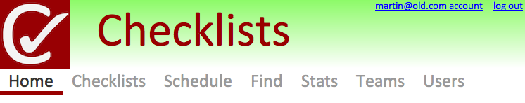
Here's an example with a full width:
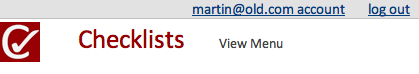
And the same html output with a much smaller screen:
Now lets look at the css behind it. (The html is the same)
body	{
	background-image: url(/apps/look/images/gradiant.png);
	background-repeat: repeat-x; margin:0px; padding:0px;
}
h1.home		{ font-size: 4.2em; font-weight: normal; color: #333333; margin: 0.2em 0 0.2em 0; }
#headerAccountBar { text-align: right; float: right; font-size: 0.8em; }
#showMenu	{ display: none; text-decoration: none; }

@media all and (max-width: 699px) {
	h1, h1.home	{ font-size: 1.4em; float: none; }
	body 		{ background-image: none; }
	#headerAccountBar { float: none; clear: both; text-align: right;
			background-color: #e2e2e2; border-bottom: solid thin Silver; margin-bottom: 0.2em; }
	#showMenu	{ display: inline; }
	#globalnav	{ display: none; }
}
First I specify the general rules and then add use a media query for overriding the default rules for when the width reaches only 699 pixels. The media query begins with the @media, all refers to all types of screen and max-width means use these rules when less than 699 pixels. For a deeper explanation of what you can do read this excellent article by Chris Coyier. I am going to talk about three things I wanted to do with the media query:
- First to remove the background image and shrink the header size as I felt it worked better for a smaller screen.
- Second I wanted to hide the menu and get users into the app quicker, this I do by showing the showMenu id option and hiding the menu.
- The third thing I did was completely change the placement and look of the account information. I mainly did this by having float: right in the main css and removing the float directive in the small screen version. I did this a lot in other places of the app as well and really liked how it turned out.
Now I also used a little jQuery, in the small screen version to show the menu up top (its always in the footer) I added a click event:
$(document).ready(function(){
	$("#showMenu").click( function( ){
		$("#globalnav").show();
		$("#showMenu").hide("slow");
	});
});
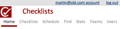
When clicking the showMenu id it disappears and the menu appears as so:
Overall media queries amazed me with how easy they are to use. Browser support is strong according to When can I use... with the only notable exclusion of current browsers being Internet Explorer. Considering that is rarely on mobile devices I don't see that as much of a downside.
Another potential drawback is that the smaller screen version still loads all the content its just hidden in the methods above. One idea I have but have not played with much is only loading the small screen then on load checking the width and using jQuery to load those parts. This could also be combined with reSize() to load content when the page changes size.
You can check this out by signing up for Checklists from the website or by installing it in the Chrome Web Store.